Decreasing discovery time by creating shared audience frameworks
Outcome
5+
research requests answered from the framework instead of a new study
audience modes replacing overlapping archetypes
years of research consolidated into a shared framework
The challenge
News brands serve extraordinarily broad audiences. At Reach, with 120+ brands and millions of readers, product and editorial teams were making decisions without a shared understanding of who they were building for.
What I did
As part of the research team, I contributed to building a set of four audience archetypes from large-scale surveys and qualitative deep dives. When I identified the framework wasn't making it into product conversations, I went back to understand why and rebuilt it by:
Running co-design workshops with product and editorial teams to understand how they made decisions
Reframing the framework around intent rather than identity
Creating a set of practical artefacts teams could use independently
Applying the framework to live product challenges to test efficiency
4
7+
Years of audience research.
A shared framework everyone could build on.
1. Introduction
Continuous audience research
Starting in 2019, the research team ran large-scale mixed-methods studies to understand why people read Reach's news, combining surveys, interviews, diary studies and analytics across national and regional titles.
Analysing the results across studies revealed consistent behavioural patterns. Regardless of brand, region or demographic, readers were coming to news for a relatively small set of reasons that shaped everything about how they consumed content, how long they stayed, and whether they came back.
From those patterns, the team developed four audience archetypes:
The Time Filler: reads to fill gaps in the day with light, entertaining content
The Social Reader: reads to stay connected and know what people around them are talking about
The Citizen: reads to understand issues that affect their lives and decisions
The Professional: reads to stay ahead in their industry
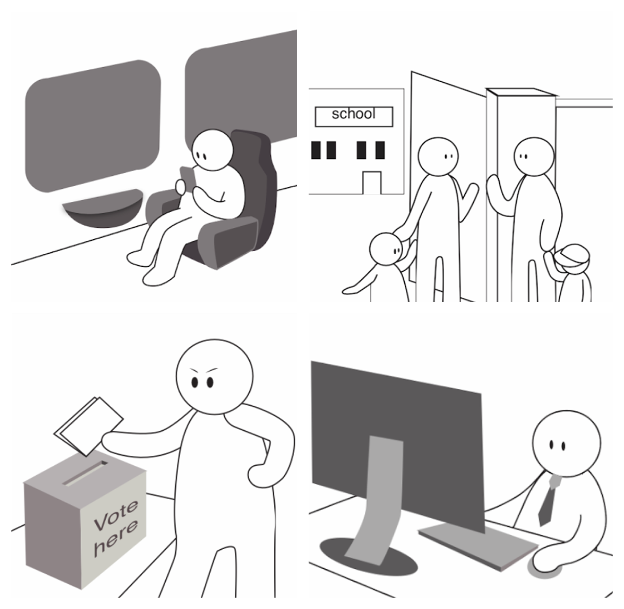
User archetypes illustrations
2. Rethinking the framework
The strategic context
The archetypes had been sitting unused for years. When the research team tried to socialise them, product teams struggled to apply them to the decisions they were actually making. It was not until conversations with editorial leadership that it became clear the framework needed to be rebuilt around their needs:
Time Filler and Social Reader motivations drove the majority of traffic to Reach's brands, a pattern consistent across years of research.
That content sits in a crowded, competitive market. Editorial was shifting strategy from volume to depth, focusing on topics readers actively seek out rather than stumble into.
Product teams needed a framework that translated that shift into something they could act on, not just understand.
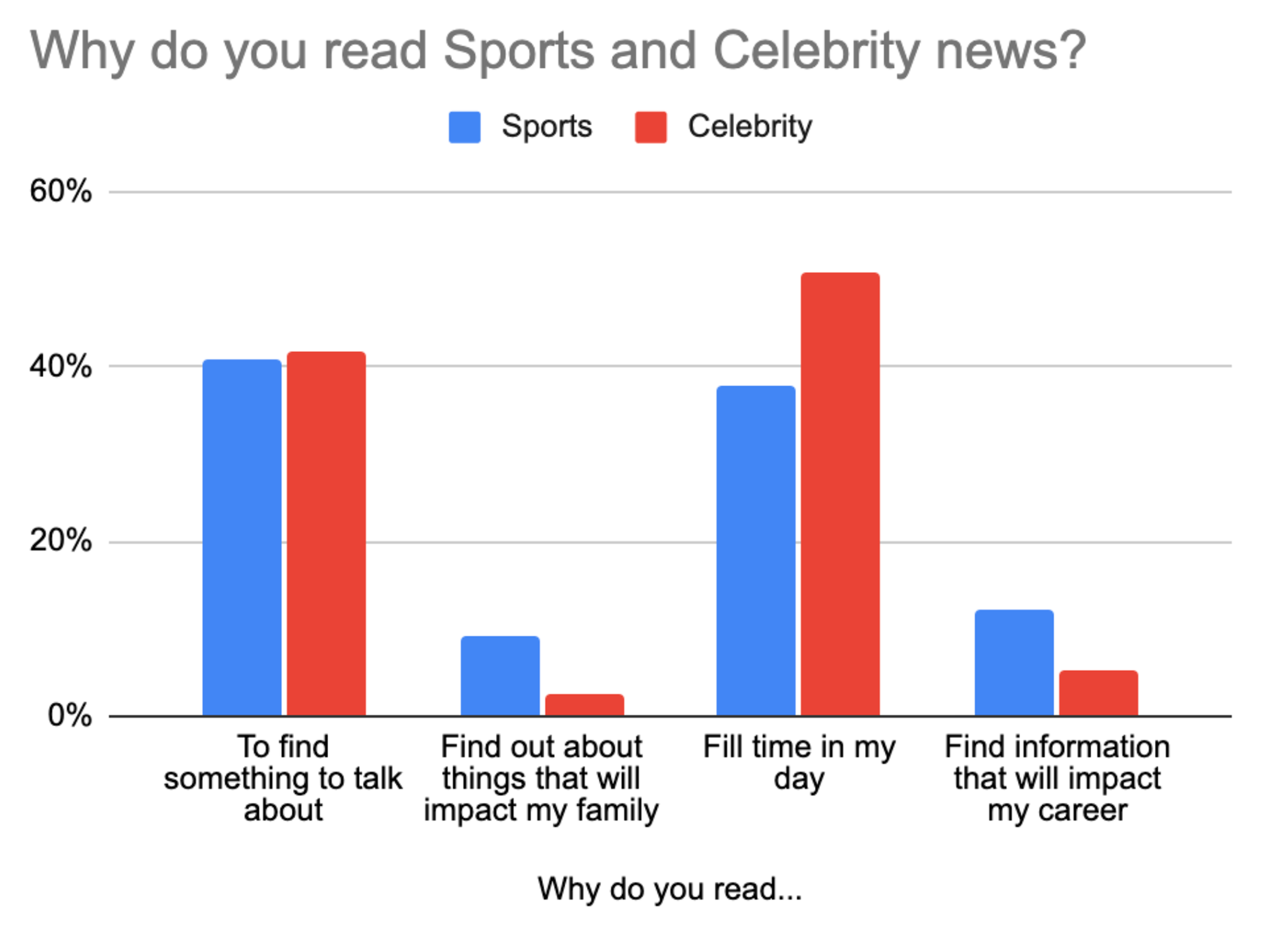
2019 survey data.
From insight to action
To understand why the archetypes weren't landing, I ran a short discovery focusing on how product teams actually made decisions:
Desk research: reviewed how other news organisations framed their audience frameworks, looking for models that had successfully crossed from research into product practice. (e.g. Reuters models, our own editorial frameworks)
Stakeholder conversations: spoke directly with product and editorial teams about how they approached feature development and where the existing archetypes broke down in practice
Shadowing sessions: Watched how Product and Design teams tried to apply the archetypes in real working sessions, noting where the language stopped them and where the overlaps created confusion
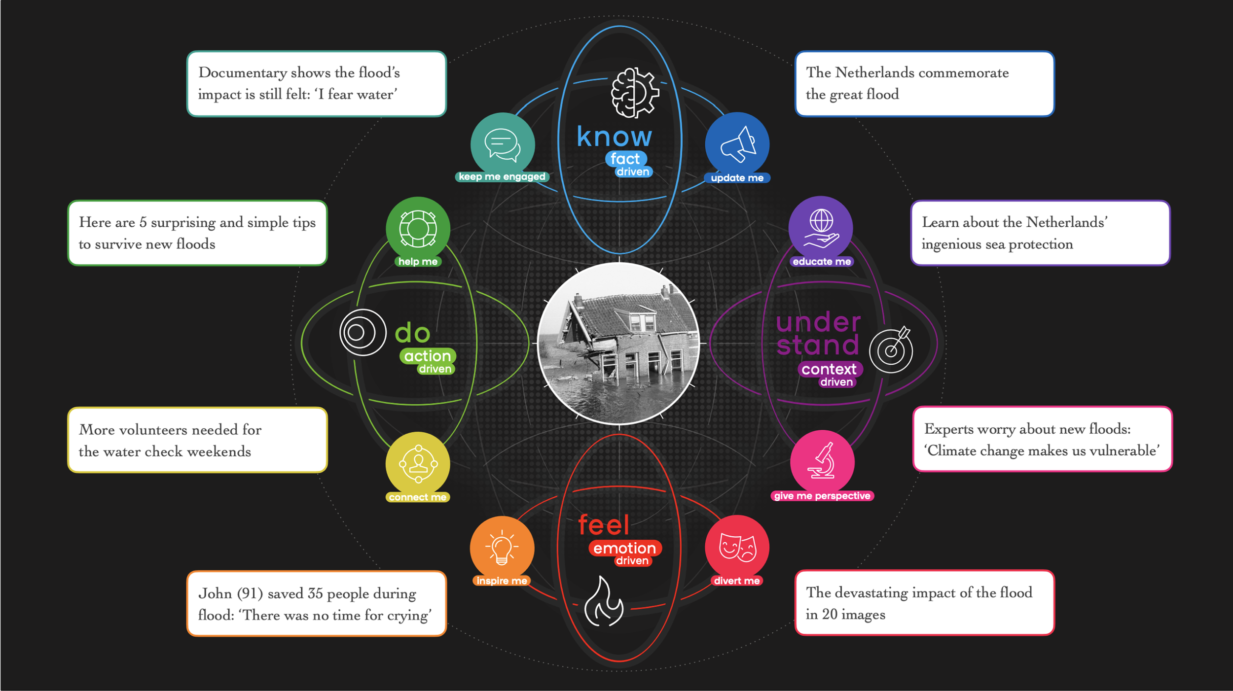
Editorial jobs to be done model
Findings
Titles that did not evoke action: archetype names like "The Citizen" described who someone was, not what they were trying to do. Teams needed something they could put at the top of a user story.
No clear differentiation: the archetypes overlapped too much to make meaningful product choices between them.
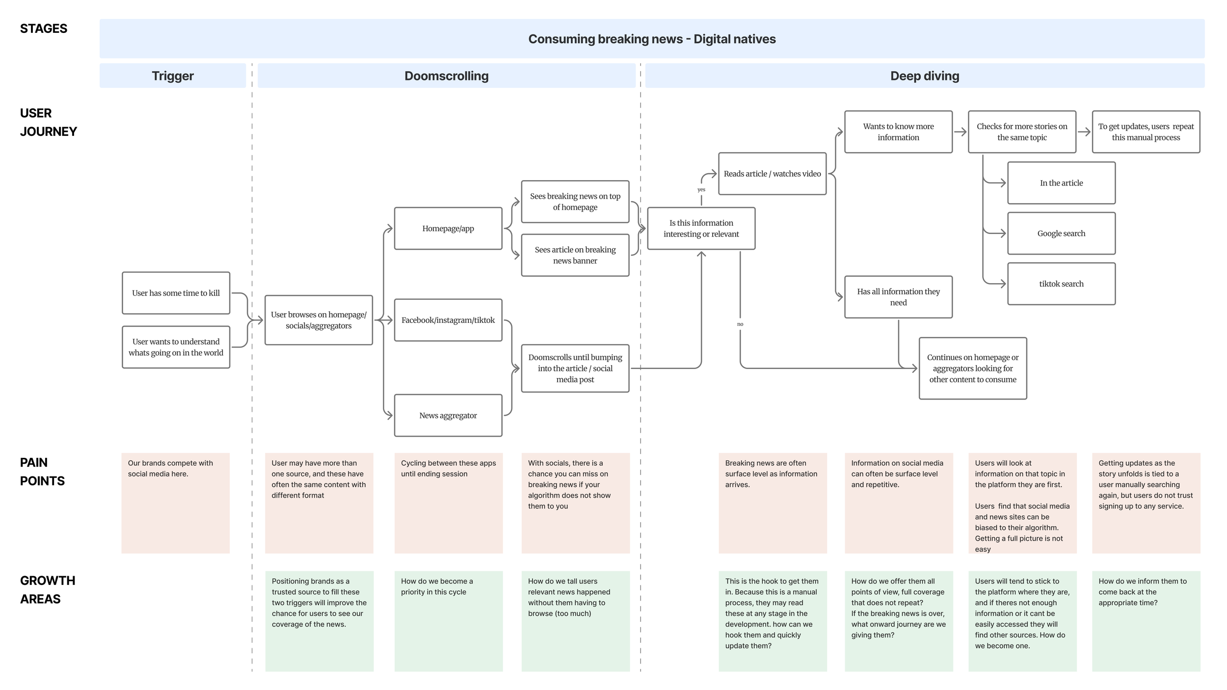
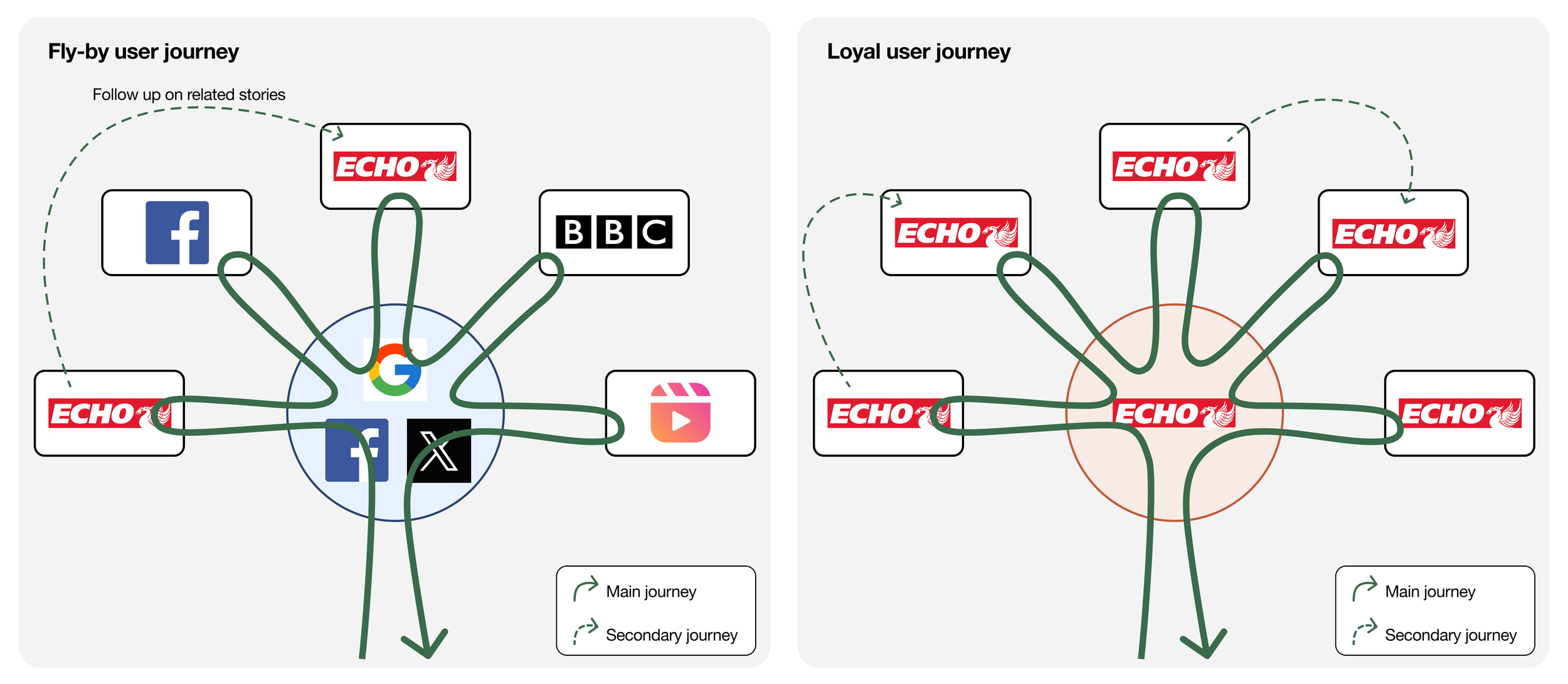
Missing user flows: there was no practical representation of what each archetype actually did on the product, where they started, what they were trying to achieve and where they ended up.
No usable artefacts: the existing outputs were research decks, not tools. Teams had nothing they could pick up and use independently in a design sprint or planning session.
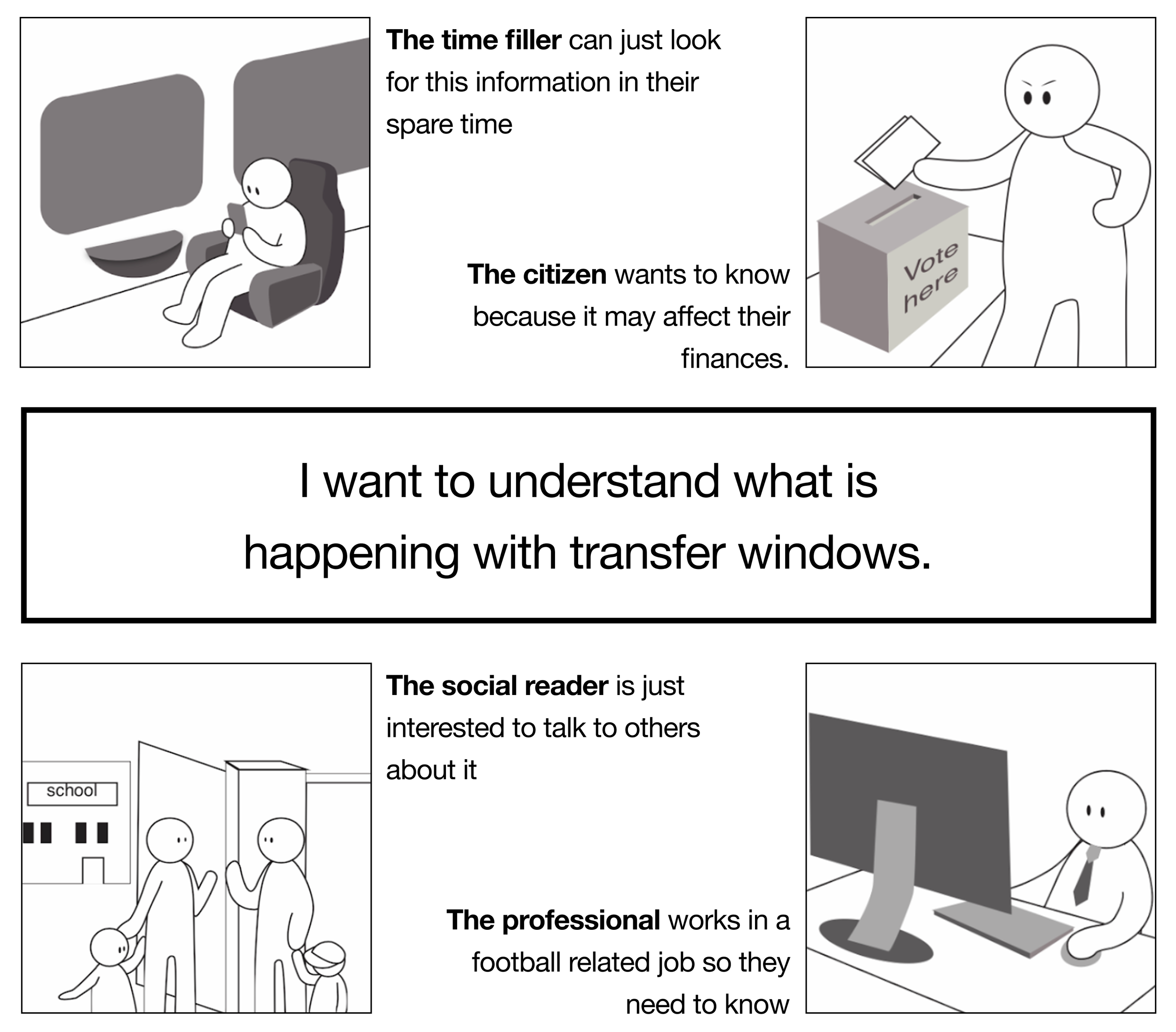
The same story. Four different archetypes. All of them valid.
Personas vs. Jobs To Be Done
The first two challenges, overlapping categories and titles that didn't evoke action, pointed to the same root problem: framing our archetypes as personas was describing who someone is, not what they are trying to do.
Looking at other models, Jobs To Be Done felt like the right fit:
A typical persona user story reads:
As [person] I want [action] to allow [outcome]
A Jobs to be Done story reads:
When [situation] I want to [action] so I can [outcome]
This framing matched the challenges we were facing far better. It shifted the focus from identity to intent, which is what product teams actually needed to make decisions.
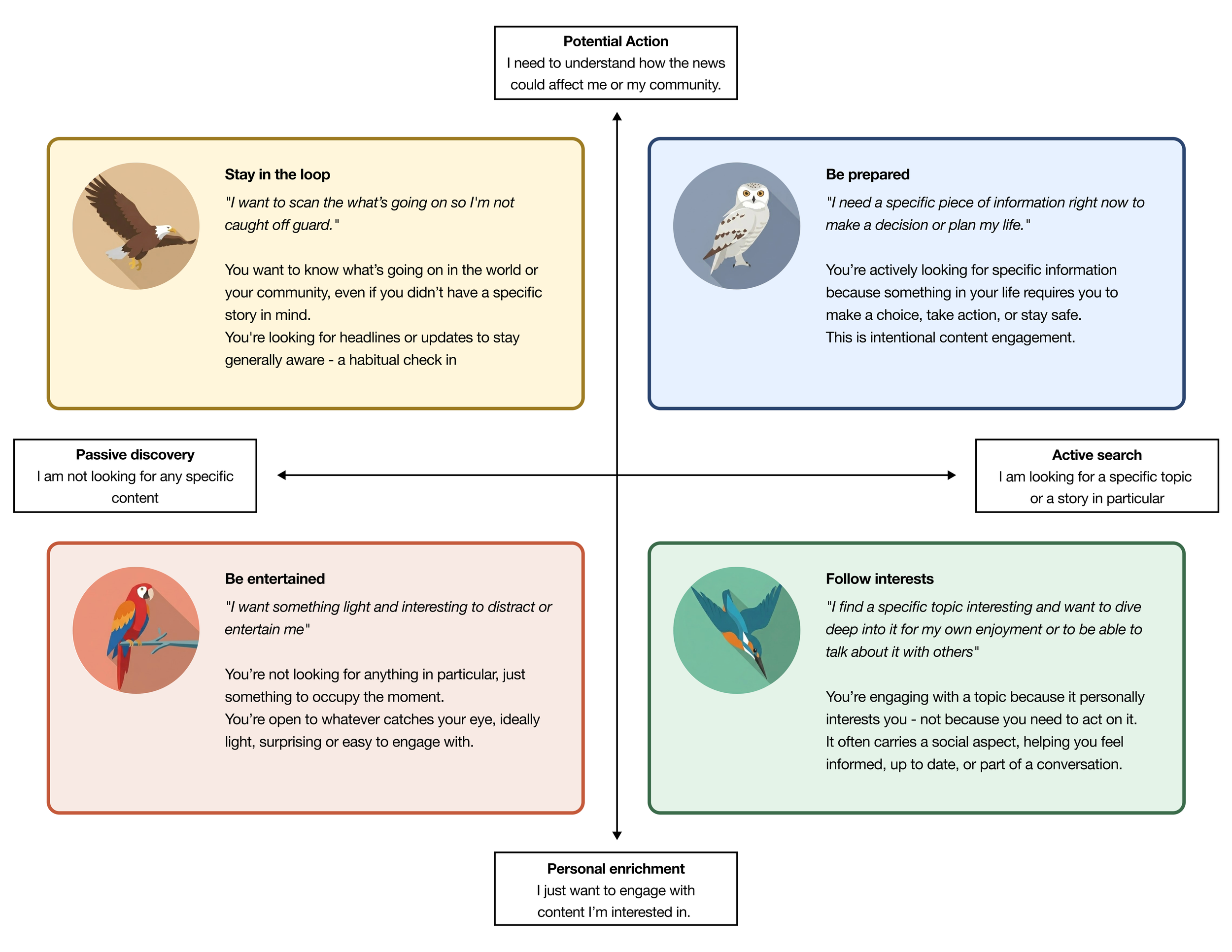
Based on the research gathered over the years, I focused on two questions that consistently separated how people engaged with news:
Actions: how are they finding the content? Users either discover news passively or actively search for something specific.
Outcomes: what are they going to do with it? Users either consume for personal enrichment or because information could affect their decisions and actions.
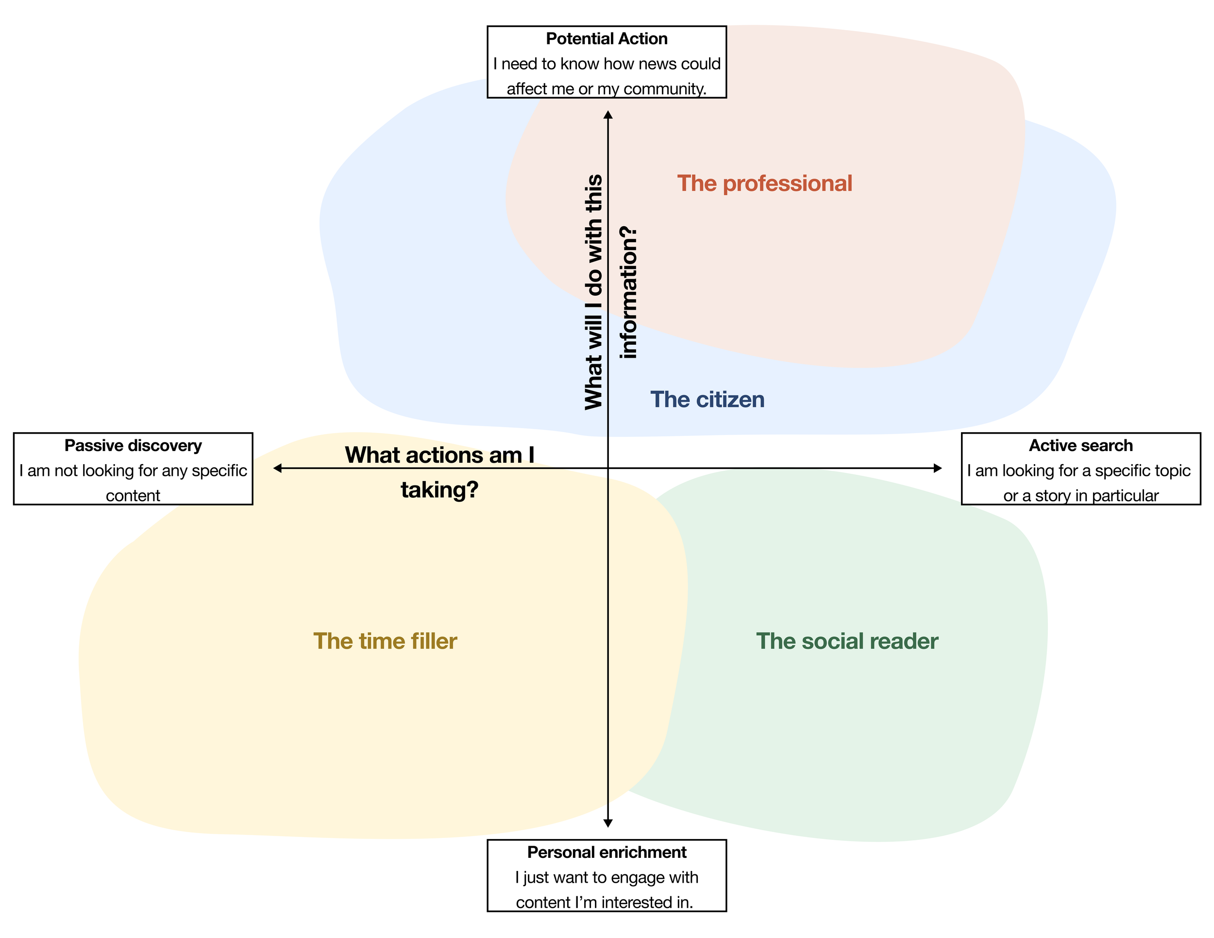
New jobs to be done framework with old archetypes fitting into them
The framework
Mapping those two axes produced four distinct, non-overlapping audience modes. Each one was named as an action rather than an identity: not "The Citizen" but "Be Prepared" to make it immediately usable in a user story. The illustrations use birds (Eagle, Owl, Macaw, Kingfisher) to reinforce that these are not different types of people, but different modes the same person can be in at different moments.
Audience frameworks matrix
A day in the life
The "When" in a Jobs to be Done story is the moment that triggers a behaviour. Mapping those moments across a typical day reveals how the same person moves fluidly between audience modes, sometimes within the same hour.

A day in the life of a user applying the new framework
Building artefacts
The framework was packaged into four cue cards, one per audience mode, designed to be picked up and used independently in any product or planning session. Each card combines the JTBD statement, the behavioural context and a typical user flow, giving teams everything they need to build for a specific moment without needing a researcher in the room.
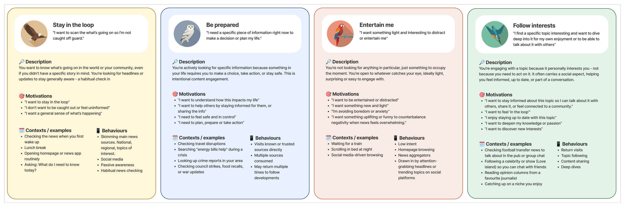
JTBD specific artefacts
3. Framework applications
The framework was designed to reduce the need for repeated foundational research, giving teams the ability to answer basic audience questions without commissioning a new study every time. But a framework is only useful if it is accurate. Two live product challenges gave us the opportunity to test that.
Trending topics widget
Product came to us with a widget that wasn't performing. The framework revealed why.
The widget was placing users in a Stay in the Loop mindset, encouraging them to scan what was going on. But clicking a topic took them to a page built for Follow Interests behaviour, requiring deep engagement with a specific subject. The mismatch was causing frustration and drop-off.
We redesigned the widget to complete the Stay in the Loop task first, giving users a summary of the topic before offering a path into deeper content for those who wanted it.
We tested both versions with users. The archetype-led redesign performed significantly better, with users successfully completing their task and expressing interest in exploring further.
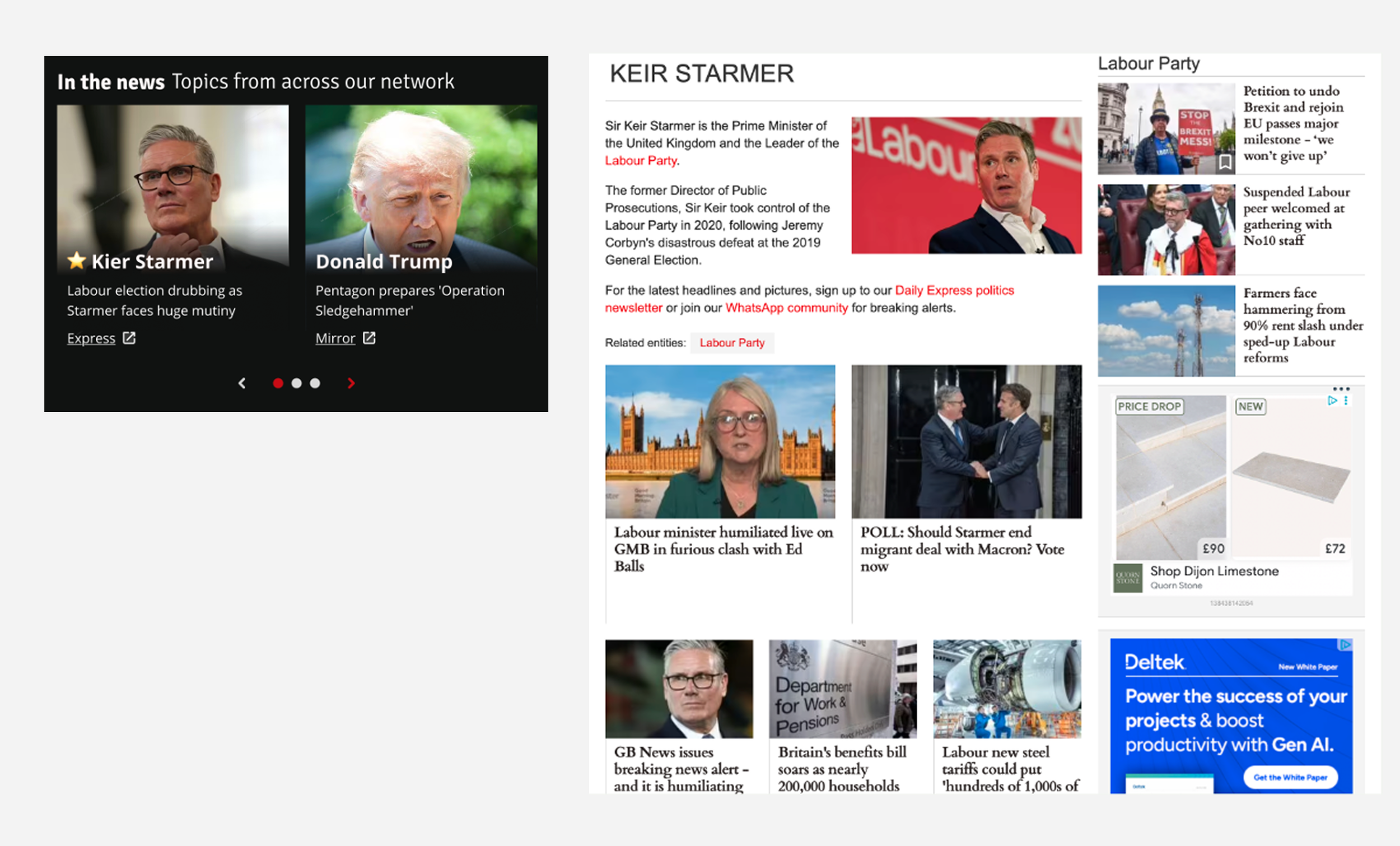
Trending topics widget
Newsletter redesigns
When design was tasked with redesigning the newsletter template, they produced one new design.
When asked to validate the redesign, we mapped the jobs to be done across our newsletter audience and found four distinct motivations. A reader opening a breaking news alert and a reader settling in for a weekend long read needed completely different formats, tone and content hierarchy.
We worked with design to build one template per Job to be done, each optimised for a specific job to be done.
User satisfaction with the redesigns improved significantly across all four versions compared to the original single template.
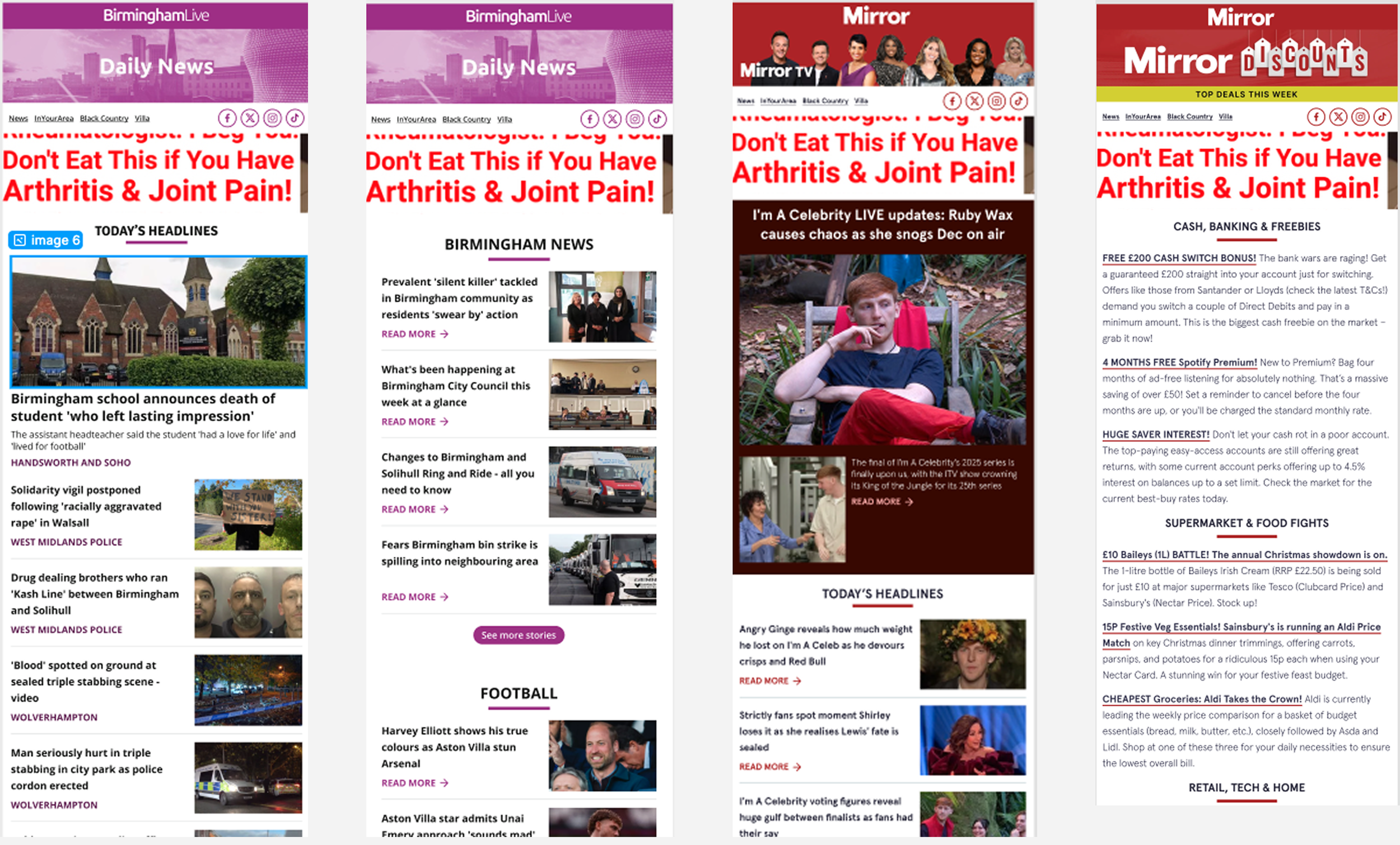
Newsletter templates
New products
The framework wasn't just useful for evaluating existing products. It became a generative tool.
We mapped the four Jobs to be done against unsolved user needs and identified gaps in the current product offering. Each mode had clear unmet jobs that no existing feature was addressing.
The session generated a set of new product concepts including hyperlocal breaking news notifications, economic impact calculators, traffic update maps and catch-me-up story summaries.
For the first time, product teams had a shared language for pitching and prioritising new ideas based on the audience mode they were designed to serve.
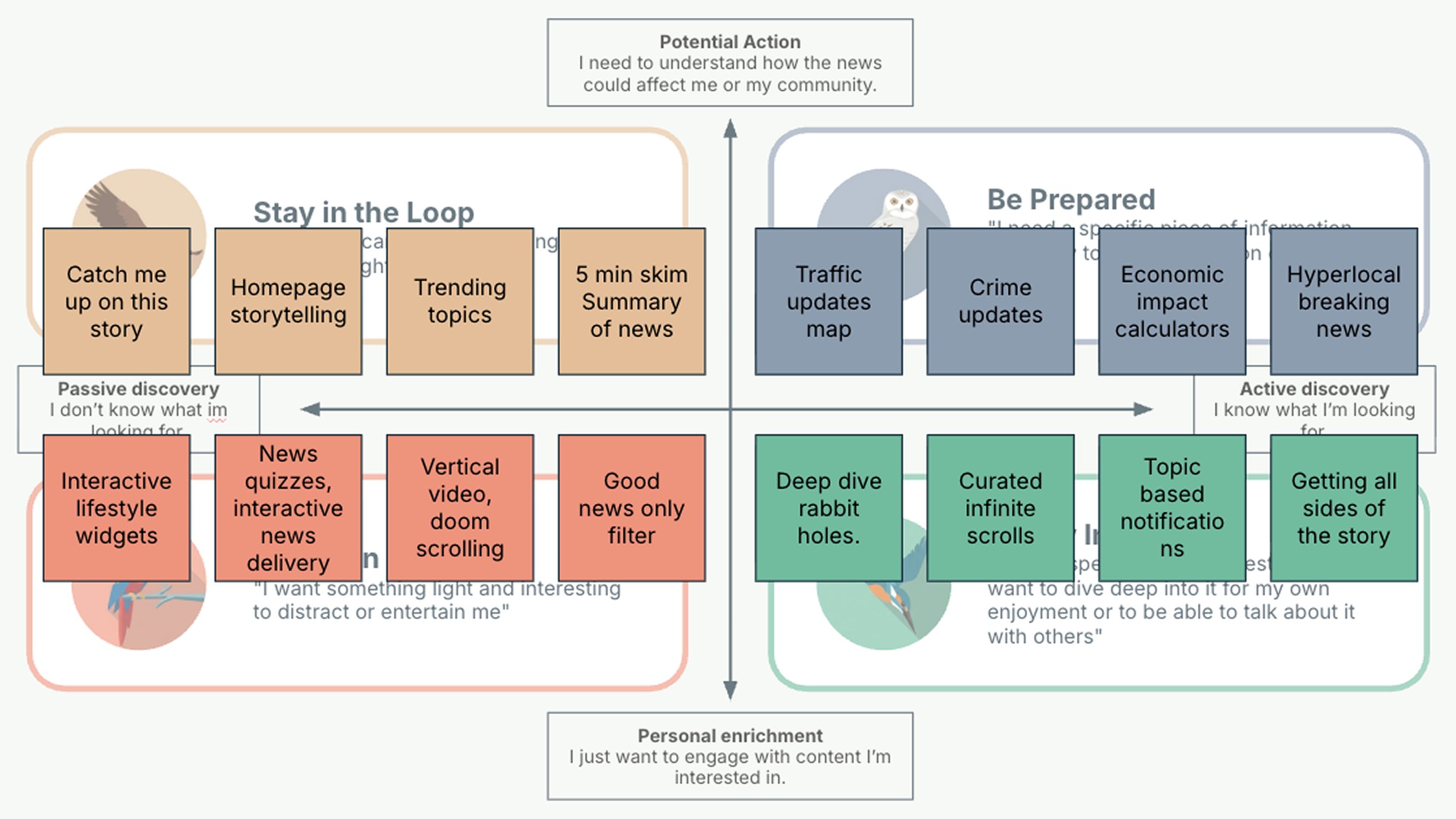
Potential product developments
4. Conclusions
I started this project by identifying a gap in the process and decided it was my problem to solve.
I went back to the research, understood why the archetypes were failing, and rebuilt them from the ground up.
I built the frameworks as a collaborative effort between product, design and research.
I stayed close to the teams until the framework was actually embedded in how people worked, not just delivered.
The result was a tool that reduced foundational research needs and gave teams a shared language they could use independently and that would outlast the person who created it.
What I learned
Simplicity is the most underrated research tool. The framework worked because it was easy enough for a product manager to pick up without a researcher in the room, not because it was sophisticated.
The hard part of research is rarely the research. Getting findings into the room where decisions happen is its own discipline, and one worth investing in deliberately.
A good framework is a starting point, not a destination. The audience modes gave teams a shared language. The next step is building more nuanced systems on top of that foundation.
Read next