Increasing regional news loyalty
with a homepage redesign
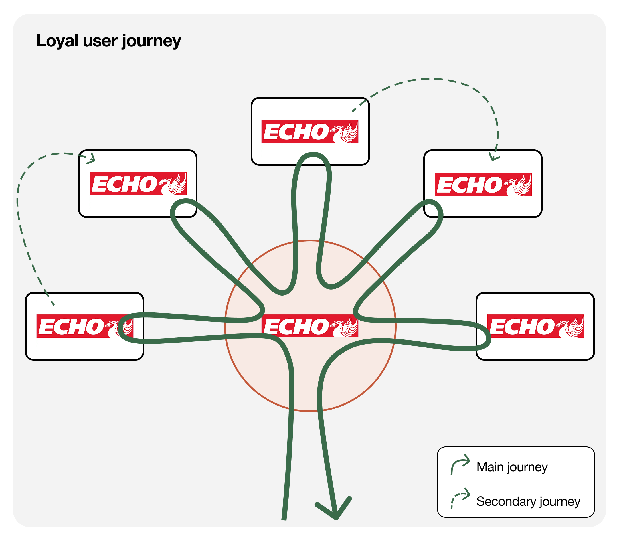
The challenge
With no formal brief beyond improving the Liverpool Echo audience experience, the service design team had to define the problem from scratch. Through research we identified loyalty as the real opportunity.
What I did
We started by getting product and editorial teams in the same room to map what we already knew about Liverpool Echo readers before speaking to a single user:
Ran a stakeholder workshop to surface existing knowledge and define the research focus
Identified loyalty as the core opportunity
Ran RITE testing across four rounds to explore solutions
Led a co-design exercise with editorial teams to understand how they build and maintain homepages
Supported design in building high fidelity prototypes and ran a final validation round
Outcome
Full homepage redesign proposal
for Regional sites.
increase in page views per session
in redesigned brands.
increase in the “homepage as a hub” journey.
Full case study below
⬇

2.6%
25%
Regional audiences have a limit.
The only way to grow is to get people to come back.
1. Understanding the challenge
This project was one of the first undertaken by a newly formed service design team. With no formal brief beyond improving the Liverpool Echo audience experience, we had to define the problem from scratch.
The first step was getting product and editorial teams in the same room. The workshop had one goal: pool everything we already knew about Liverpool Echo readers before speaking to a single user.
Workshop goals
Mapping where Liverpool Echo features in readers' lives (yearly, monthly, weekly, daily)
Thinking through reader motivations using the archetypes
Capturing pain points and future opportunities
Establishing two “How Might We” statements that set the direction of the study
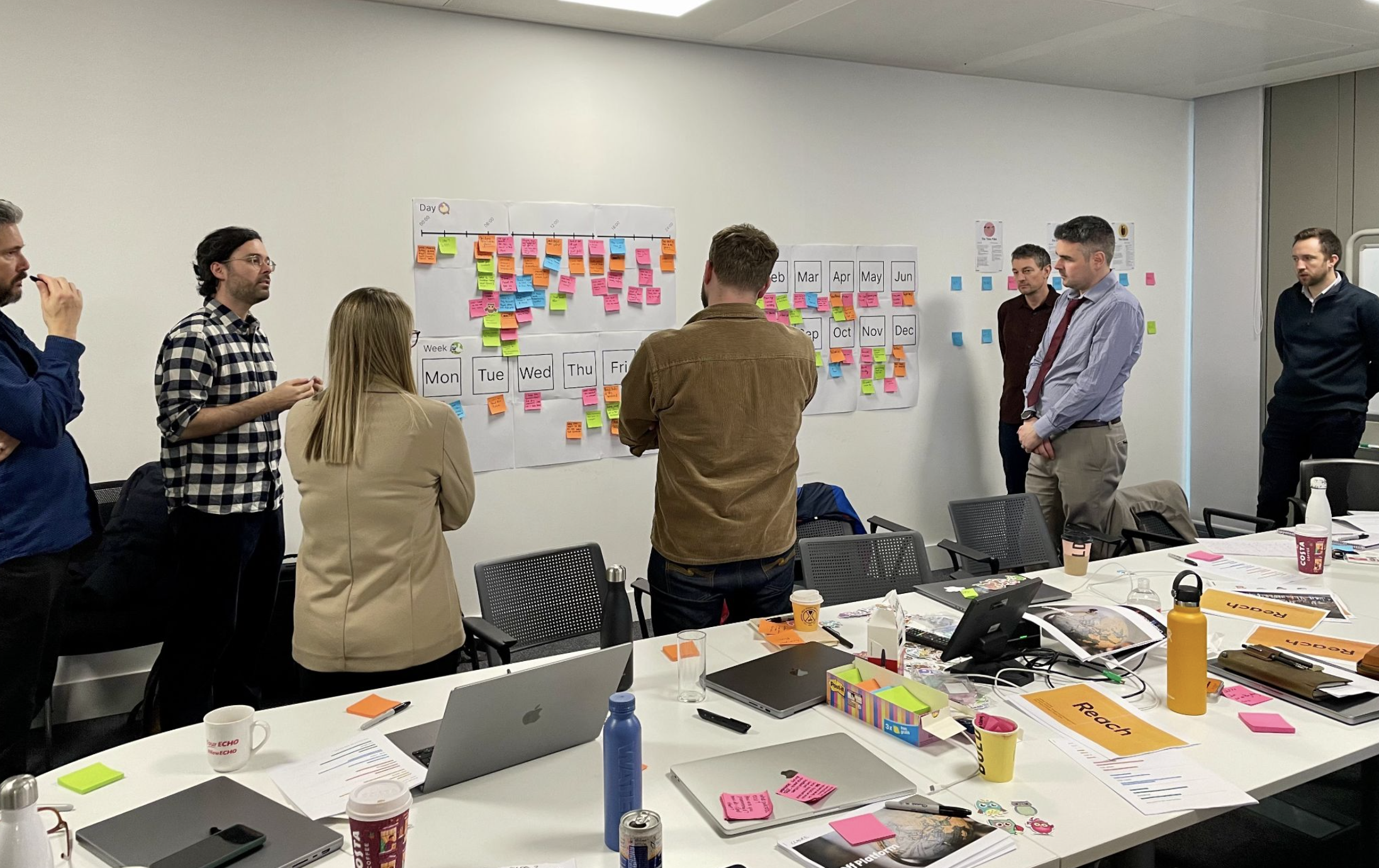
Workshop with editorial and product teams
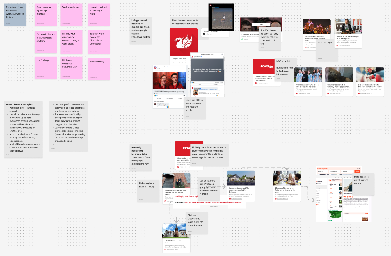
Workshop analysis: mapping motivations and user journeys.
Workshop analysis
The workshop output was synthesised alongside existing research and an expert heuristic review of the Liverpool Echo experience. Grouping the motivations and touchpoints revealed a clear pattern: the product was built around fly-by users, readers who arrive via social media or search, consume one article and leave. But the most valuable audience, loyal readers who visit directly and return multiple times a day, were largely being ignored.
That gap became the focus:
“How might we increase the relationship between readers and brands to grow page views and build long term loyalty?”
2. Research planning
Research planning
Because we didn't have time to run formative research before the workshop, the output was based on a mix of existing data, internal knowledge and stakeholder assumptions. To counter any potential bias, we designed a two phase research process: an initial round of depth interviews to test those assumptions and understand real user behaviour, followed by four RITE iterations to evaluate and refine potential solutions.
The full process involved 26 sessions across three weeks — 10 depth interviews of 60 minutes each, and 16 RITE sessions of 45 minutes each, all conducted remotely.
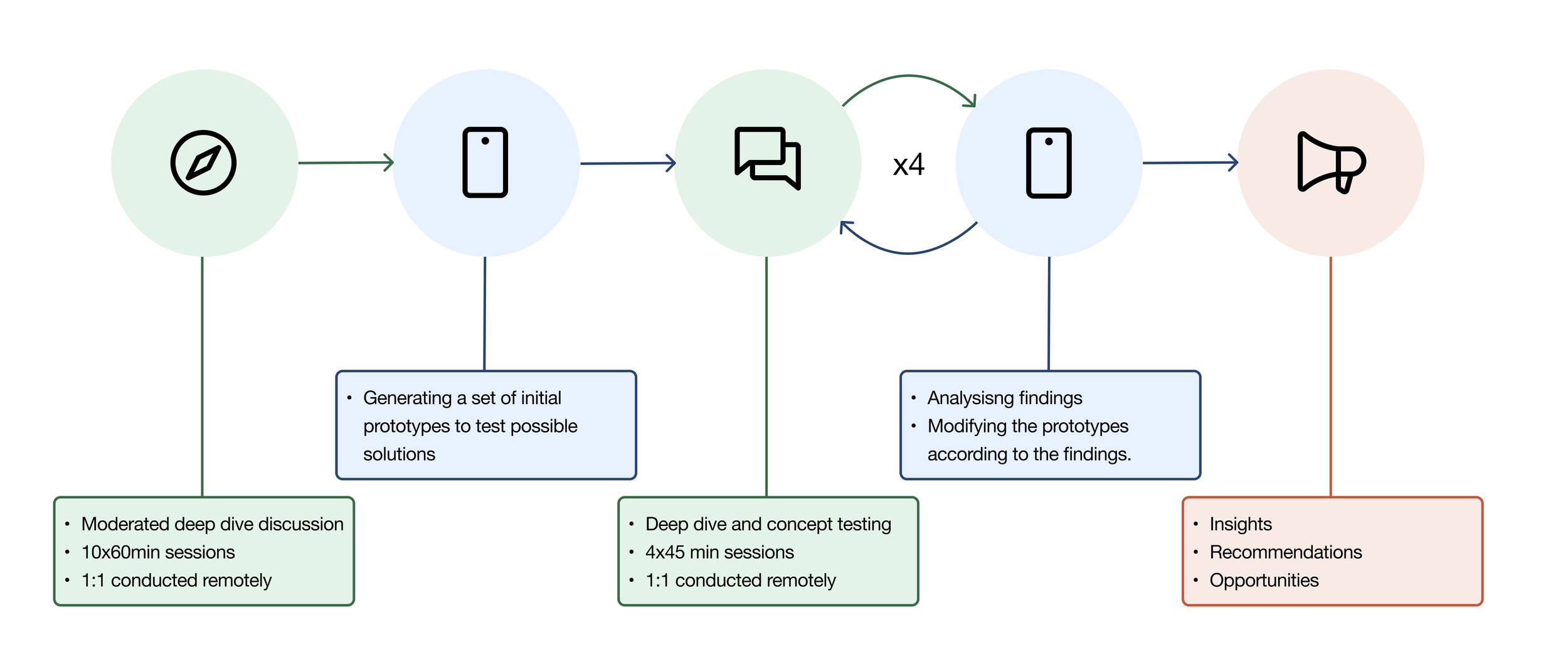
Research planning diagram
Recruiting participants
Participants were recruited directly through an advertisement on the Liverpool Echo website, screened and onboarded by recruitment agency.,
Based in Liverpool or surrounding areas
Interests including going out for meals, drinks, events and local attractions
Age skewed towards the 35 to 74 bracket, reflecting Echo readership demographics
Mix of social grade, ethnicity and gender
If the goal was to grow loyalty, we needed to start with the people who were already loyal and understand what kept them coming back. Previous research had focused heavily on fly-by users. This study was a deliberate shift in focus towards a smaller but significantly more valuable cohort.
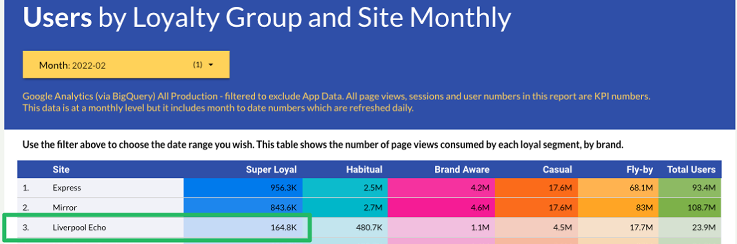
L.E. audience by loyalty group. 165k super loyal vs 17.7m fly-bys.
3. Initial interviews findings
The flyby and loyal journeys
The initial interviews revealed something unexpected: fly-by and loyal readers navigate news in fundamentally the same way. Both groups use a central hub to browse, click into articles and return. The difference is not the behaviour, it is the platform. Fly-bys hub through social media feeds and news aggregators. Loyal readers hub through the Liverpool Echo homepage directly.
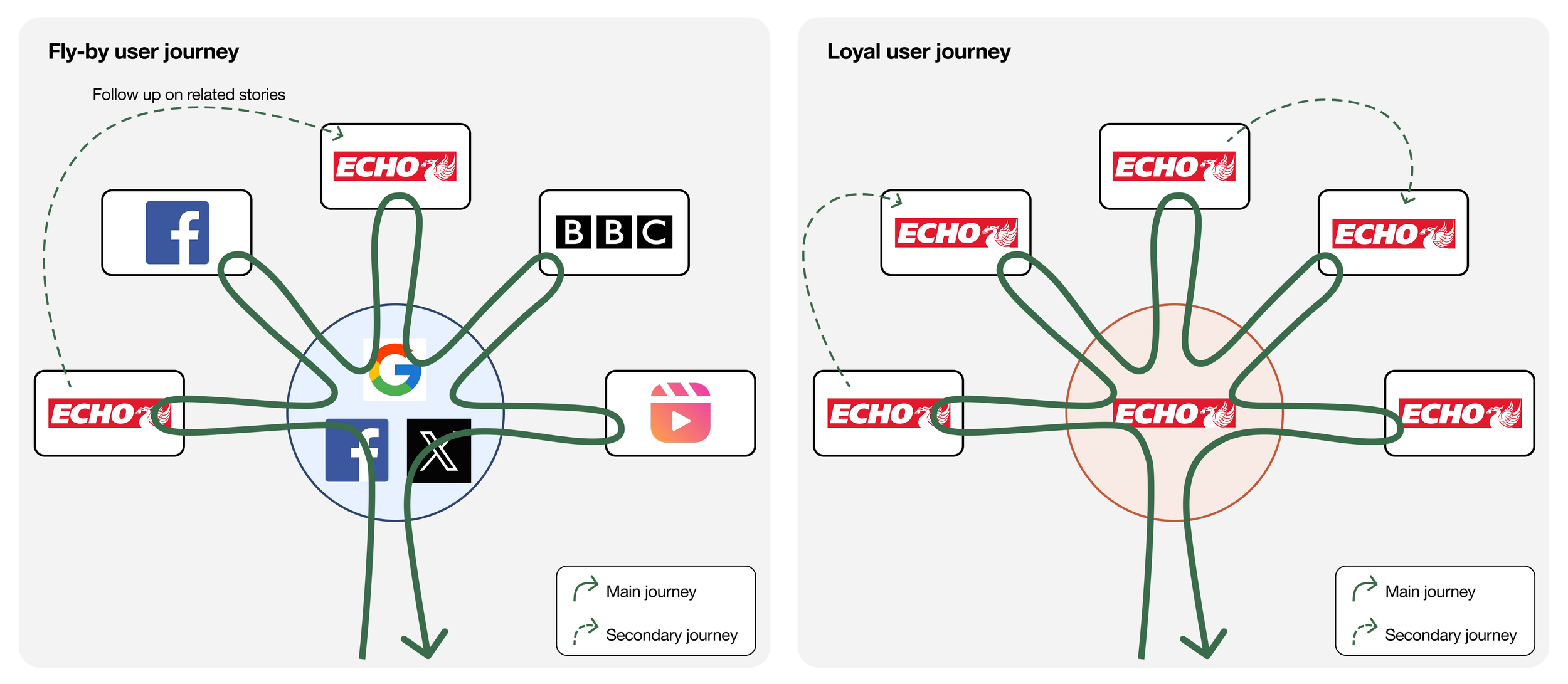
Current editorial strategy
A UX review of the Liverpool Echo revealed a product built almost entirely around driving pageviews from fly-by users. Read More links, Taboola widgets, article grids and next/last article arrows were all designed to squeeze one more click out of casual visitors.
This approach had clear downsides:
Click-through rates on recirculation links sat at around 1%
Users had learned to ignore Taboola, reading it as advertising rather than editorial content
Manually curated read more lists became irrelevant over time and are hard to maintain
Loyal users usually ignore recirculation, going back to the homepage after every article
The opportunity was clear. We needed to help users understand that the Liverpool Echo homepage was worth coming back to, and build an experience that made that true.
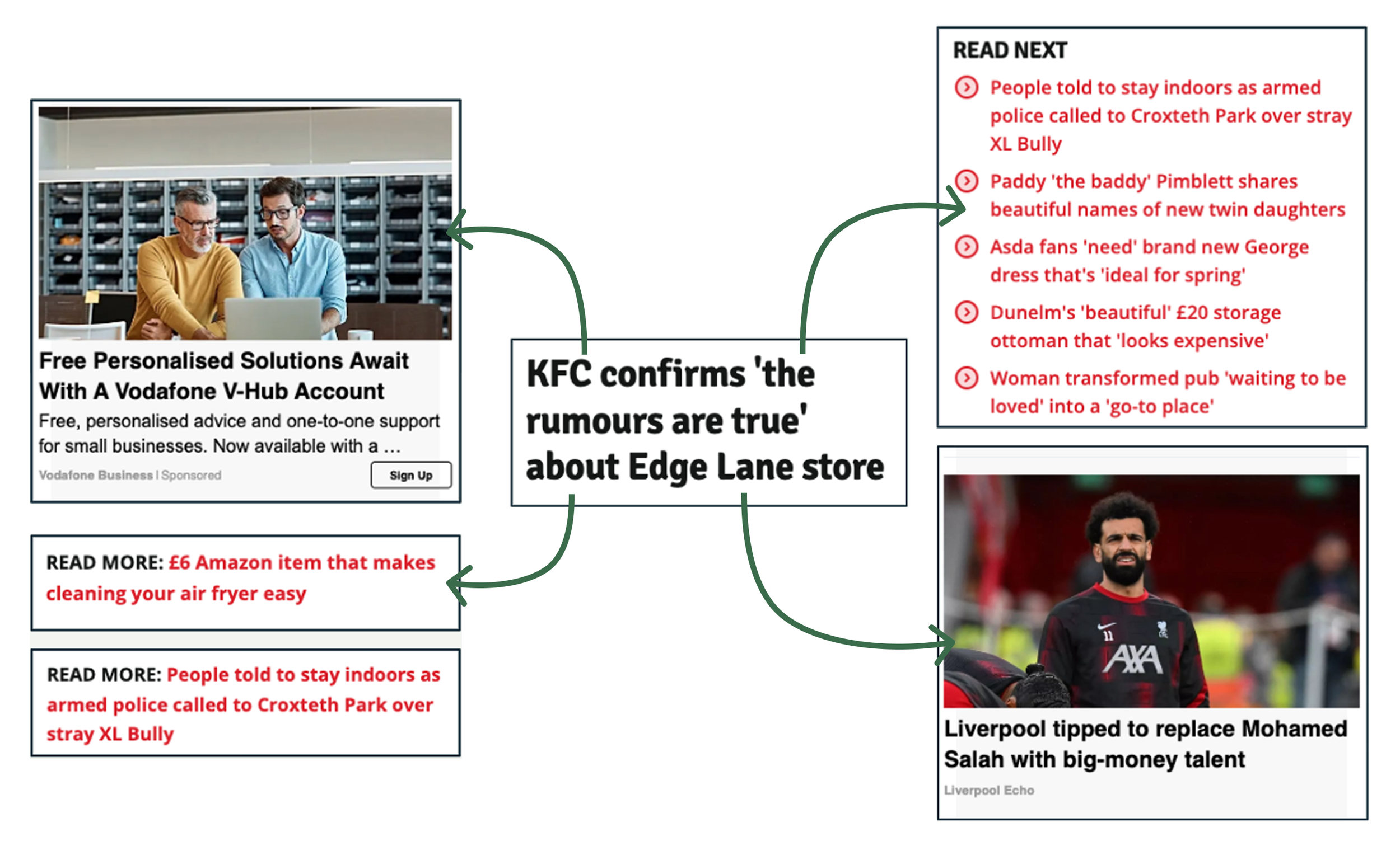
Different types of recirculation elements
4. R.I.T.E. findings
The initial interviews gave us a clear direction: loyal readers wanted the Liverpool Echo to be their go-to hub, but the homepage wasn't giving them enough reason to trust it. We used four rounds of RITE to explore three areas, using What's On as our testing ground.
Homepage structure
Hypothesis: Breaking the homepage into clear sections would help users understand what the site contained and find content they cared about.
Test: We restructured the homepage into categorised sections and tested different ways of organising content.
Findings: Structure was seen as a clear improvement. Users gained a faster overview of available content and found their areas of interest more easily. Repetition across sections was flagged as a risk to manage.
Recommendations: Introduce a consistent section structure across the homepage. Manage content carefully to avoid repetition across categories.
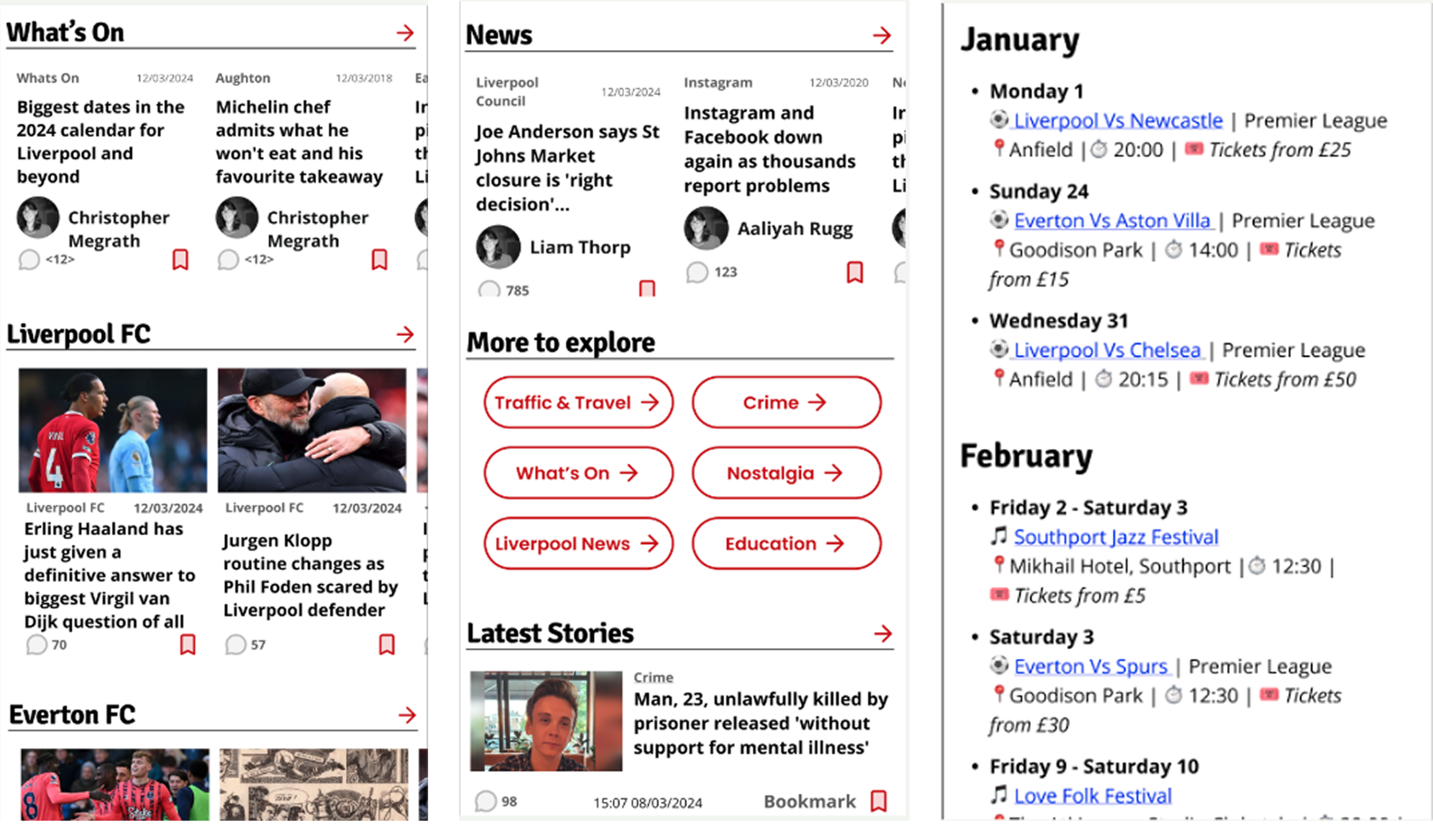
Exploring new homepage structures
Widgets
Hypothesis: Adding elements that would remain in the hompege and showcasing information in a more interactive way would encourage users to explore beyond the article feed.
Test: We introduced widgets (must reads, summaries, interactive maps) and category buttons alongside the restructured homepage.
Findings: Anything that looked different from a standard article grid was immediately read as an advert and ignored. New features need to be introduced gradually and designed to clearly distinguish themselves from on-page advertising.
Recommendations: Introduce new homepage elements gradually. Invest in design that clearly differentiates editorial content from advertising.
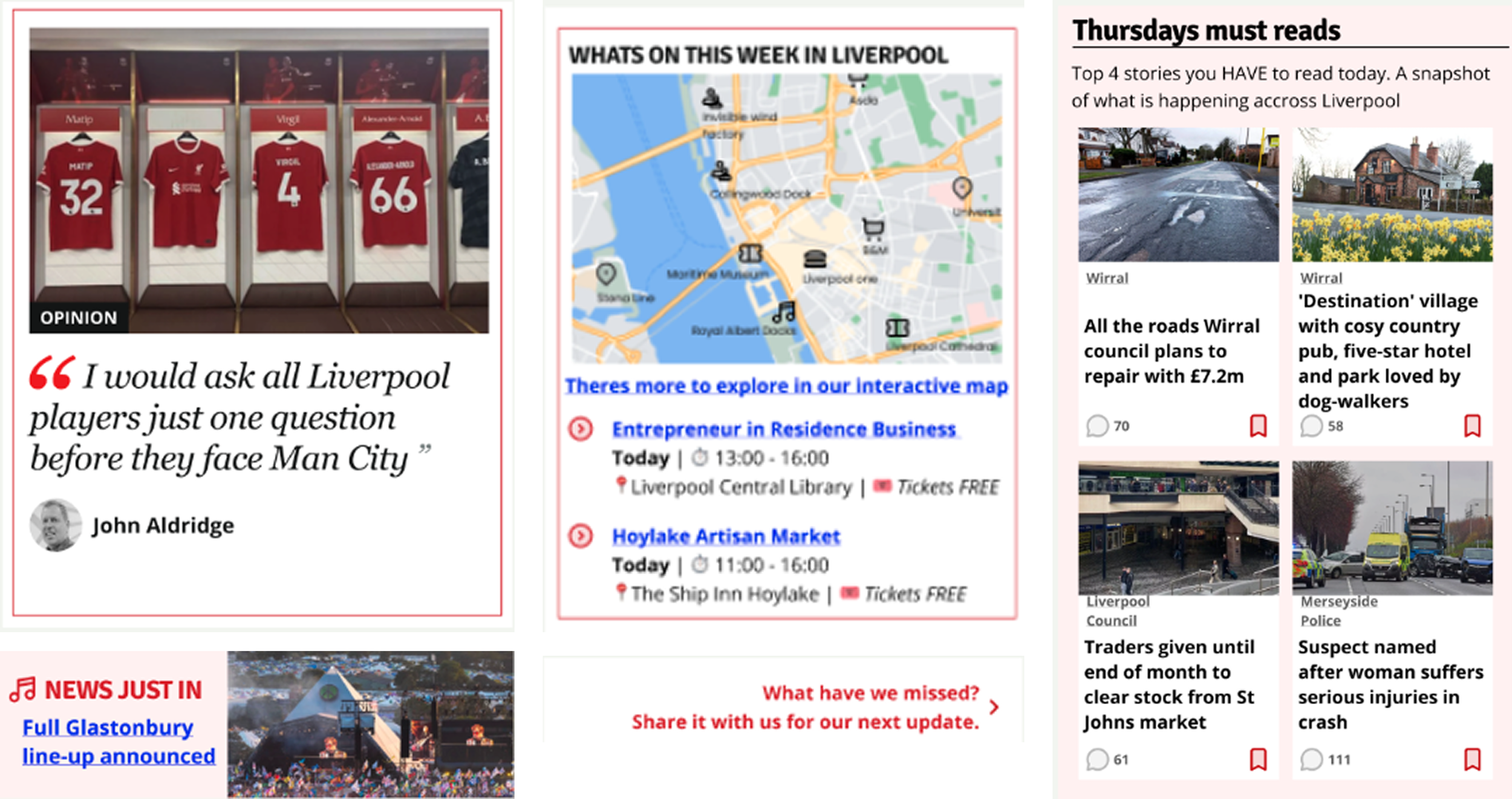
Exploring new ways of displaying content
Evergreen content
Hypothesis: Surfacing better structured event content would rebuild user trust in the What's On section and make the Echo their go-to for local information.
Test: We added structured event lists with locations, prices, times and ticket links, plus an interactive map of things to do in Liverpool.
Findings: Users responded well to the structured format and the map. However, finding specific content on the current site remained difficult. The bigger opportunity was a permanent, well designed What's On hub rather than improved individual articles.
Recommendations: Redesign What's On as a permanent hub with an interactive map, filterable events and structured information. Move away from article-based content as the primary format for event information.
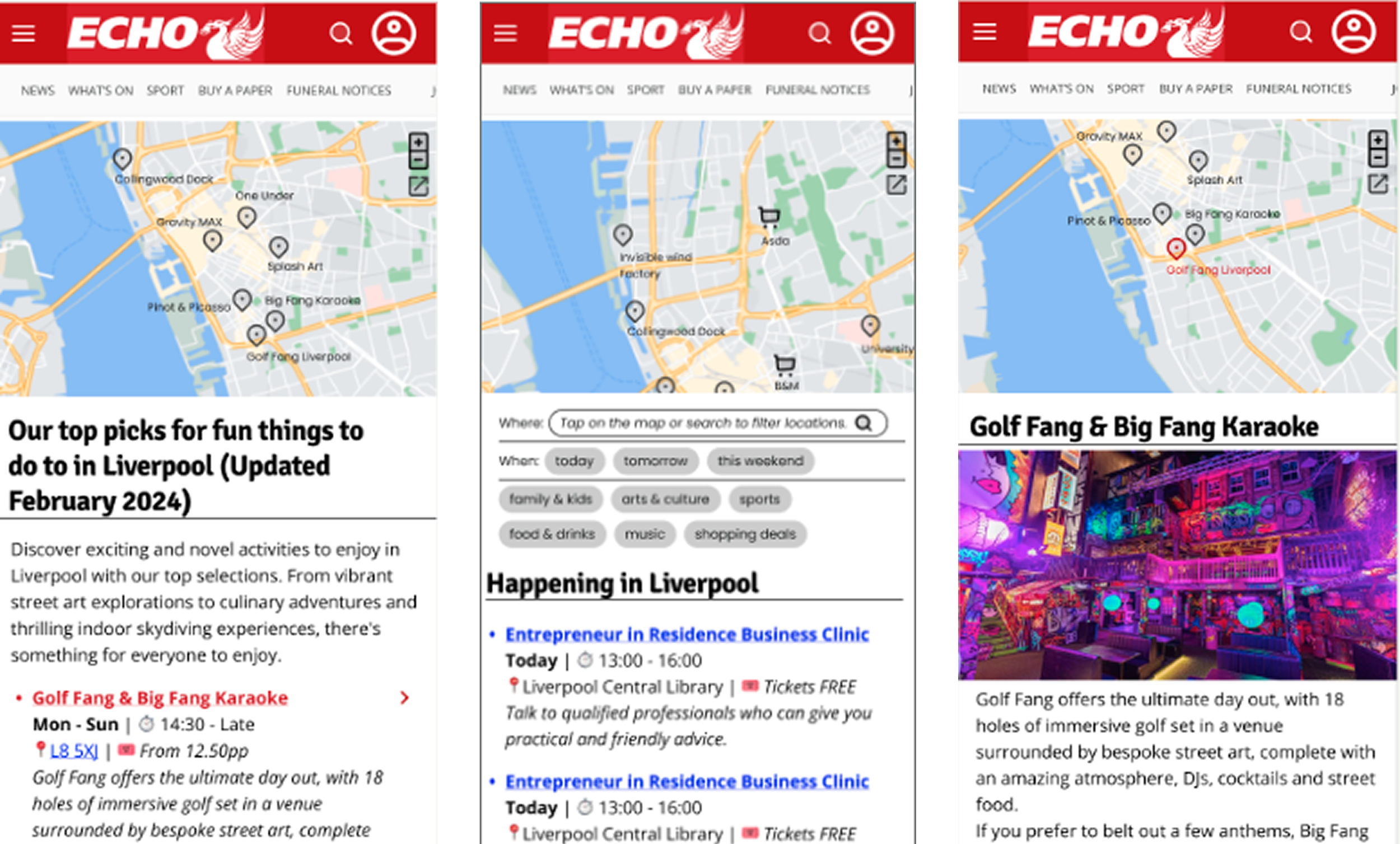
Exploring evergreen articles
5. Redesigning the homepage
Taking findings to editorial and commercial teams
The user research had surfaced a clear set of assumptions about what the homepage needed to do. Before taking those into a redesign, we needed to validate them with the people who build and maintain the homepage every day. We also needed to understand their constraints, priorities and ways of working, as any solution that ignored editorial reality would never survive contact with the newsroom.
Editorial Co-creation exercise
Working alongside the product design team, we ran co-creation sessions with nine senior editorial figures from across Reach, including the Liverpool Echo editor, the MEN content editor and the Mirror's Digital Editorial Director. Each session combined a short interview with a homepage building exercise: participants were given printed wireframe components and asked to build their ideal homepage across three scenarios, an average news day, a breaking news day and a planned event.
Editors think about the homepage situationally, not as a fixed layout
Brand purpose and editorial pride quietly shape decisions alongside page views
Resource constraints vary so dramatically across brands that any redesign had to be flexible enough to work at every scale
The homepage is a 24/7 shift effort, requiring solutions that work across editors with different styles and levels of digital experience
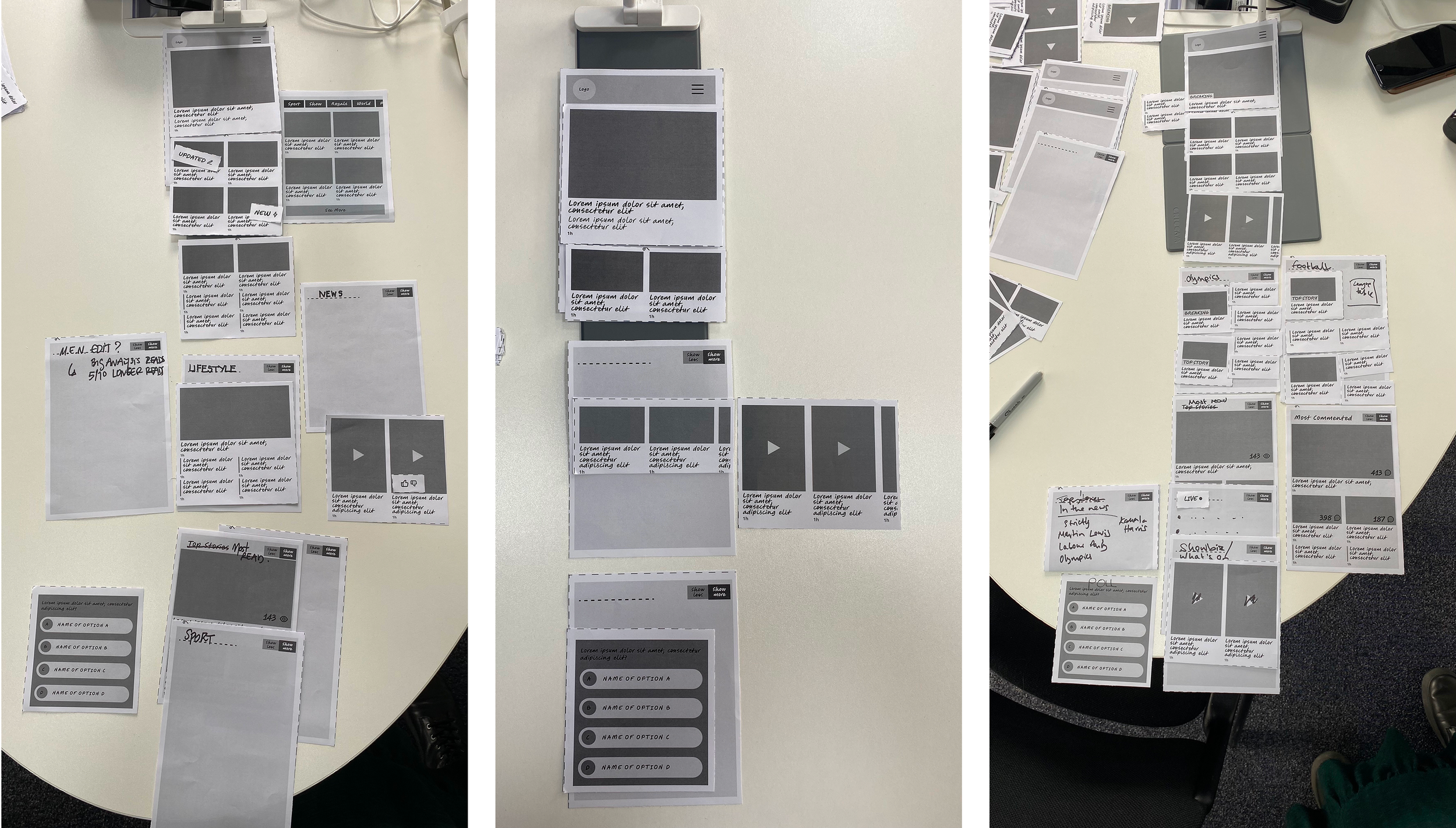
Editorial workshop Co-creation exercises
Understanding commercial constraints
With the editorial requirements understood, we then took the proposed homepage structure to the commercial team to establish the advertising constraints any redesign would have to work within. A series of conversations produced a clear set of rules:
These constraints were fed directly into the design system, ensuring the homepage could be both editorially strong and commercially viable without one compromising the other.
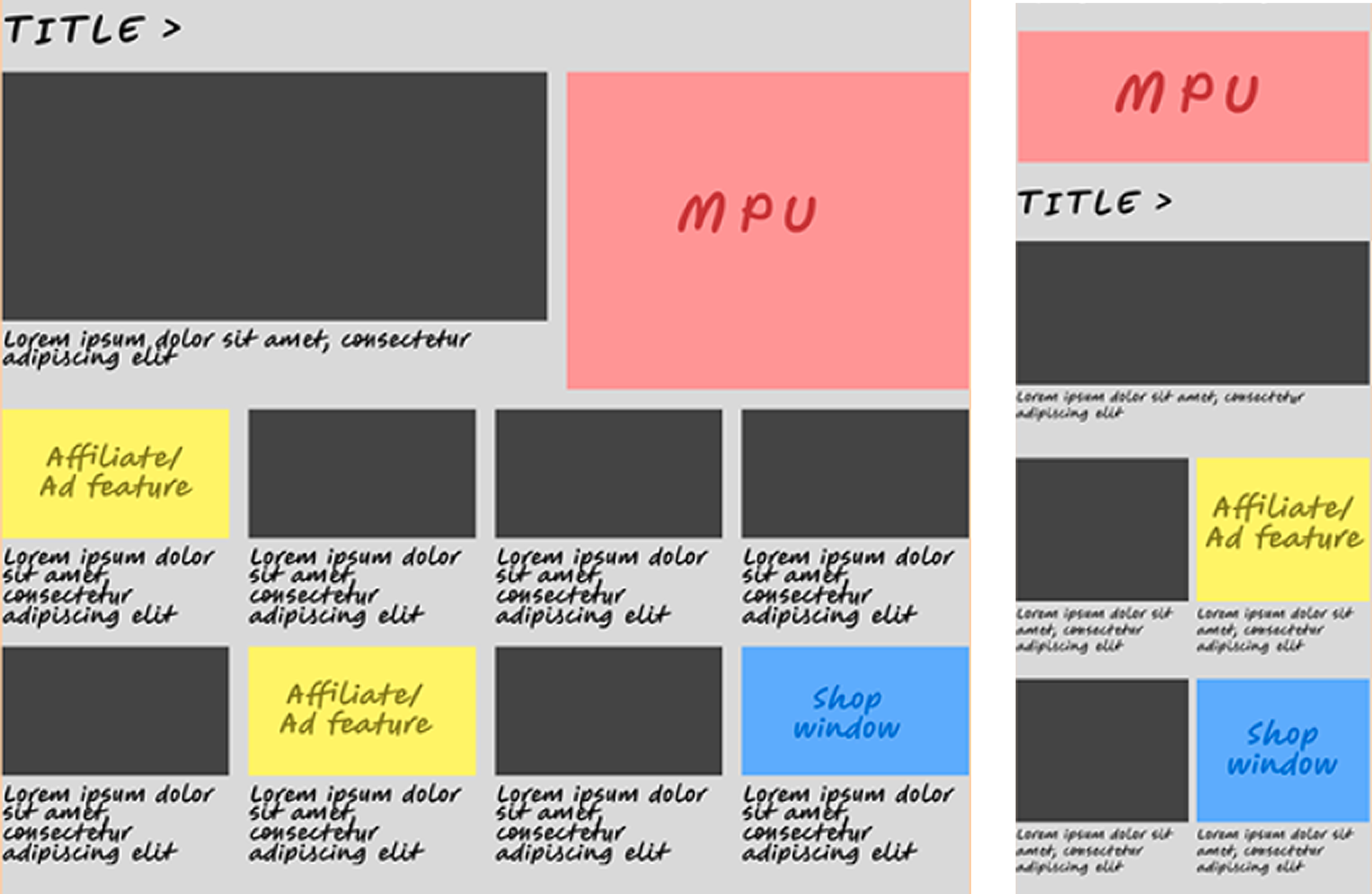
Commercial constraints
Validating the redesign
With the new homepage structure built, we ran a final round of usability testing with 12 readers to validate the design decisions made throughout the project.
The results were encouraging:
The section layout was well received, helping readers identify content of interest and skip sections that didn't apply to them
Readers were able to browse the homepage and find content to read more easily than before
Images and headlines remained the primary decision making elements, with interactive features and flags largely overlooked during initial scroll
Section naming needed to be clearer at a glance — where labels were ambiguous, readers skipped entire sections rather than investigating further
The testing confirmed that the structural changes recommended through the research were working as intended, while surfacing a clear set of refinements for the next iteration.
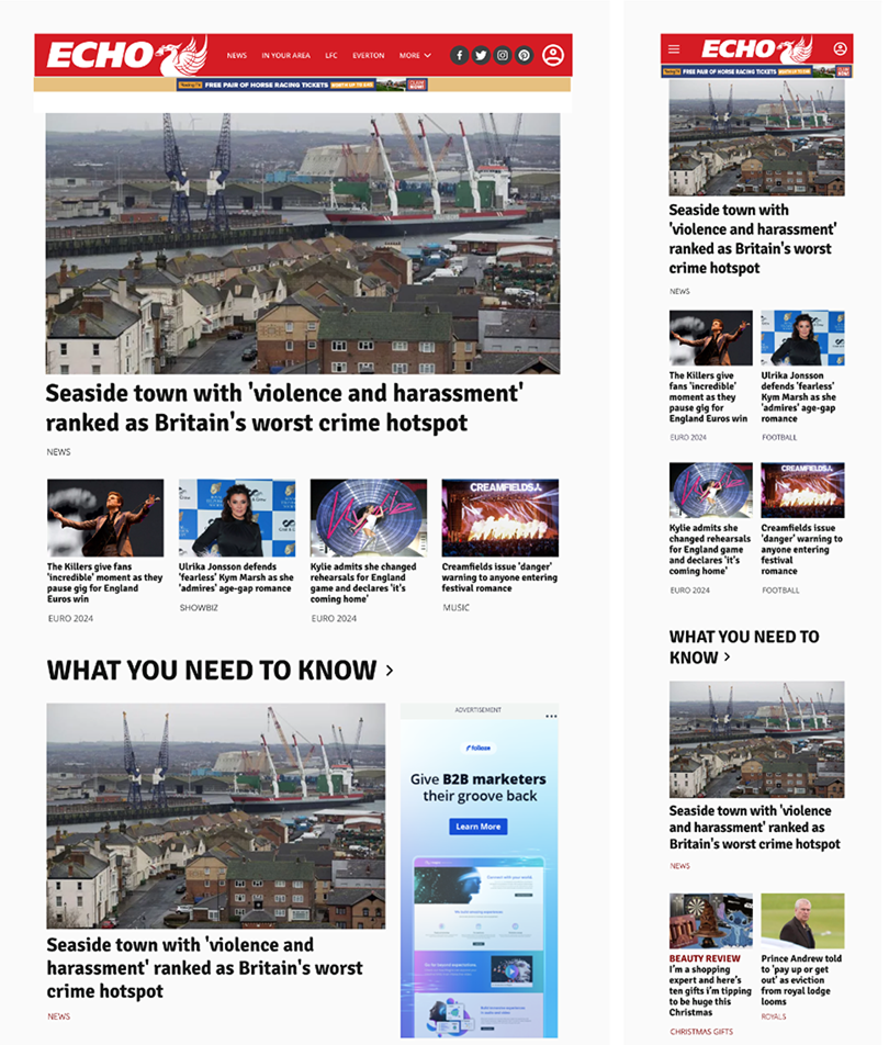
The new Liverpool Echo homepage
6. Conclusions
This project started with three words: make it better. No brief, no hypothesis. Just a new service design team and a blank page.
We defined the problem ourselves, ran the research to validate it, and designed our way to a solution that product actually built
The project combined generative research, service design workshops, RITE testing, co-design with editorial and commercial teams, and a final validation round
Each method was chosen deliberately, not because it was on a checklist
The homepage redesign that came out of it was informed by everyone who had a stake in it: readers, editors, commercial teams and designers
The numbers backed us up: 2.6% increase in pageviews per session and 25% increase in homepage hub conversion